
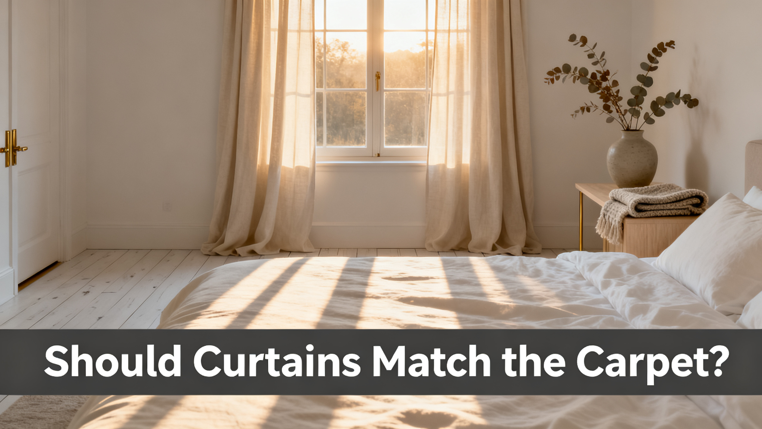
No. Curtains should not match the carpet exactly. They should coordinate, undertone matched and value gap held, and the surface that cannot be changed anchors the pairing. That is the whole answer. The rest of this piece is the four-rule framework that gets you there without the swatch regret.
The trap most Pinterest boards push is “just get something neutral in the same family.” Neutral without undertone match is exactly where the beige-on-beige regret lives. Sorting whose undertone anchors, and how much value gap the room can carry, is the move that separates a chosen room from a matchy-matchy one. Everything downstream lives in the full curtain color pairing hub before extending the same framework to walls and bedding.
The Answer, In One Card
No, coordinate. Don’t match.
Rule 1
🎯 Undertone Match
Warm to warm, cool to cool. 50% of the outcome.
Rule 2
📏 Value Gap
Hold a 2-value gap. Never the same value with a different undertone.
Rule 3
⚓ Anchor Decision
The fixed surface anchors. Carpet is usually the anchor.
Rule 4
🎨 Pattern Budget
One patterned surface per room. The other two stay solid.

The panel this carpet-match guide is built around
Liz Linen Drape Pleated
from $59/panel · 350 gsm linen blend · 38 colorways, 12 read cleanly against the 5 most common carpet families · 9 header styles · 6 lining options. Final price depends on size and lining.
Use code JULY for 20% off sitewide · Free shipping over $300
The Answer, Answered Four Ways
Sounds like a boring coordination question. In practice it is four questions, and the carpet is fixed while the curtain is a $59 to $199 decision. The pairing that lands depends on which of the four sub-angles you weight highest. Undertone alone decides about 50% of the outcome. Contrast level, room hierarchy, and persona split the rest.
The Undertone Angle (50% of the Decision)
Every carpet carries a warm or cool bias under the named color, and the bias is what your curtain has to answer to. The Munsell color notation for hue, value and chroma is the industry reference that formalizes where a beige carpet sits on the warm-to-cool axis. Warm beige carpet lives around 2.5Y to 5Y. Cool grey carpet drifts toward N6 with a slight 5PB pull. Greige, the ambiguous family, lands closer to N7 leaning either way depending on the fiber.
Fiber changes what you see. The Carpet and Rug Institute technical reference notes that nylon reflects light and reads cooler than the swatch card, wool absorbs light and reads warmer and deeper, and polyester sits between. Read the fiber before you read the color, or the pairing decision misses by half a value.
The 5 Carpet Undertone Families · What Each One Wants
Family 1
Warm Beige
Munsell 2.5Y-5Y. Yellow-tinged pile.
Wants: Sand Beige, Burlywood Birch, or navy complement.
Family 2
Cool Grey
Munsell N6, slight blue pull.
Wants: Fog, Snow White, or rust warm accent.
Family 3
Greige
Munsell N7, drifts warm or cool with the LED.
Wants: Grey Beige tone-on-tone, or Snow White lift.
Family 4
Wood-Brown
Warm mid-tone wool, oak, walnut rug.
Wants: Burlywood Birch, Sepia Ebony, or cream.
Family 5
Cream / Ivory
High LRV, warm neutral base.
Wants: Navy Blue, Rust Brown, or Sepia Ebony contrast.
How to Choose Curtain Color: The 5-Criterion Framework
The parent framework this article inherits from. Five criteria, three persona picks, one framework that scales to every fixed surface in the room.
Real talk: “just get something neutral” is the tip that ruins the most rooms. Neutral without undertone match is exactly where beige-on-beige goes sideways. Match the undertone, don’t fight it. Warm carpet asks for a warm curtain or a cool complementary accent. Cool or greige carpet asks for a cool curtain or a warm accent that echoes in the room’s hardware.
⚠️ Carpet fiber changes how you read the color. Nylon reflects light and reads slightly cooler than the sample card. Wool absorbs light and reads warmer and deeper. Polyester sits between. Judge the fiber first, then the color, or the swatch decision misses by half a value.
The Contrast Angle (Lighter or Darker Than the Carpet)
Contrast is the value gap between the two surfaces, independent of undertone. Same color family, different value. The room reads legible only when there is a 2-value minimum gap between curtain and carpet. Same value in a slightly different undertone is the worst outcome, because the eye reads the mismatch as a mistake rather than a choice.
Five tiers cover the practical range. Tone-on-tone: 1-value gap, same undertone family, the safest luxury look. Low: 2 values, subtle lift. Mid: 3 to 4 values, comfortable contrast for standard 8-foot ceilings. High: 5 values, statement pairing that requires echo elsewhere. Bold: complementary hue at high value gap, reserved for designer-controlled rooms with 10-foot ceilings.
How to Choose the Right Curtain Length
Puddle, kiss, or float above the carpet. The length decision changes how much curtain touches the floor visually and shifts the perceived contrast.
Contrast Value Ladder · 5 Tiers Against Carpet
Tier 1 · Tone-on-Tone
1-value gap.
Pick: Grey Beige on greige carpet.
Tier 2 · Low Gap
2 values, safe lift.
Pick: Sand Beige on warm beige carpet.
Tier 3 · Mid Gap
3 to 4 values.
Pick: Fog on charcoal grey carpet.
Tier 4 · High Contrast
5 values, statement.
Pick: Snow White on dark navy carpet.
Tier 5 · Bold
Complementary hue.
Pick: Navy Blue on cream carpet.
If it were my own living room with a Berber greige carpet, the pick would be Grey Beige 1908-6, tone-on-tone, cotton flannel lining, and a 108-inch drop kissing the floor. Same undertone, one value up, the eye reads the room as intentional rather than accidental.
The Room Hierarchy Angle (Which Surface Anchors)
The strategic question underneath every carpet-match pairing is which surface is fixed and which one is chosen. The fixed surface is always the anchor, and the anchor sets the undertone that everything else answers to. Get the anchor wrong and even a technically correct undertone match reads slightly off.
Three cases cover almost every American living room. Fixed rented carpet, the carpet is the anchor and the curtain follows. Carpet replaceable at a future date, the curtain can lead and the carpet becomes a temporary companion. Both surfaces new (custom build or full remodel), the wall paint anchors both because it is the largest surface and shares the most light with the curtain.
Anchor Decision Flowchart · 3 Cases
Case 1
🔒 Fixed Carpet
Rented apartment, first home, no repaint budget.
Anchor: carpet. Curtain matches carpet undertone, holds 2-value gap.
Case 2
🔄 Replaceable Carpet
Carpet replacement planned in 1 to 3 years.
Anchor: curtain. Pick the 8-year curtain first, coordinate carpet to it.
Case 3
🎨 Both New
Custom build or full remodel.
Anchor: wall paint. Both carpet and curtain answer to the wall undertone.
The Persona Angle (Renter, Owner, Designer)
Same question, three different answers depending on the buyer. The renter treats the carpet as noise to minimize until the next lease. The owner treats it as canvas to respect for the next 8 years. The designer treats it as one layer to orchestrate against curtain, wall, and hardware.
Renters lean toward Fog 1908-18 or Snow White 1908-0, low commitment, follows to the next apartment, blanches out whichever rental carpet is under the panels. Owners lean toward Sand Beige 1908-3 or Grey Beige 1908-6, undertone-matched to the fixed carpet, cotton flannel lining for the long-term drape. The bedroom scenario asks a related question about whether curtains should match the bedding, which pulls a different set of levers.
Designers lean into contrast: Sepia Ebony 1908-14 or Birkin Velvet in Emerald over a medium carpet, 108-inch drop with a 2-inch puddle, blackout lining, and often a sheer layered over a colored panel for the two-layer texture the pile can carry.
The 8 Curtain-and-Carpet Pairings That Actually Work in 2026
Eight Liz colorways cover the 5 carpet families with a mix of tone-on-tone, low contrast, and bold. Each cell of the matrix is a pairing that survives the swatch test under three lighting moments. The mechanic under each verdict is spelled out in the paragraphs that follow.
Color Swatch Matrix · 5 Carpet Families × 3 Curtain Verdicts
Warm Beige Carpet
Safe: Sand Beige 1908-3
Mid: Burlywood Birch 1908-5
Bold: Navy Blue 1908-36
Cool Grey Carpet
Safe: Fog 1908-18
Mid: Snow White 1908-0
Bold: Rust Brown 1908-9
Greige Carpet
Safe: Grey Beige 1908-6
Mid: Snow White 1908-0
Bold: Sepia Ebony 1908-14
Wood-Brown Rug
Safe: Burlywood Birch 1908-5
Mid: Sepia Ebony 1908-14
Bold: Snow White 1908-0
Cream / Ivory Carpet
Safe: Ivory White 1908-2
Mid: Sepia Ebony 1908-14
Bold: Navy Blue 1908-36

Sand Beige 1908-3 on warm beige carpet is the tone-on-tone default. Same warm family, one value lighter, the eye reads a monochromatic warm envelope. Sand Beige leans slightly yellow and answers to Manchester Tan or Shaker Beige carpet fibers without pushing pink at 4pm.
Fog 1908-18 on cool grey carpet is the cool monochromatic default. The Fog colorway carries a slight blue-grey undertone that echoes charcoal and slate carpet without going icy. Owners of Fog on Berber grey report the pairing reads calm at 9am and holds its cool bias under evening LED.
Grey Beige 1908-6 on greige carpet is the undertone-matched safe. Greige is the ambiguous family that can drift warm or cool under the same LED depending on the fiber. Grey Beige splits the difference and holds tone-on-tone against wool greige and nylon greige alike.
Snow White 1908-0 on dark carpet is the high-contrast lift. A 5-value gap between white curtain and charcoal or deep navy carpet extends the wall upward and pulls the eye off the floor. Works on ceilings 9 feet and higher. On 8-foot ceilings the contrast can feel chopped.
Burlywood Birch 1908-5 on wood-tone floor with warm rug is the tonal harmony. The colorway sits in the same warm mid-tone as oak and walnut fibers, and the pairing reads as continuous woodgrain warmth. Skip cool whites, they interrupt the wood tone.
Navy Blue 1908-36 on cream carpet is the complementary punch. Deep cool against warm high-value ground is the pairing designers use when the room needs one confident anchor without going bold on the walls. Requires a navy echo somewhere in the room (art, cushion, hardware) or it reads floating.
Sepia Ebony 1908-14 on light beige or greige carpet is the luxury high-contrast. A 5 to 6 value gap between deep chocolate curtain and pale carpet reads intentional in ceilings over 10 feet. On 8-foot ceilings the pairing compresses the vertical.
Rust Brown 1908-9 on greige carpet is the warm accent over cool base. Rust adds the warmth greige lacks without forcing an undertone flip. The pairing works best when a rust element (leather chair, terra cotta pot, brass hardware) echoes elsewhere.
What Color Curtains Go with Grey Walls?
Grey carpet often pairs with grey walls. If both surfaces are grey, the pairing rules shift again. The sibling guide covers 8 curtain colors by grey wall undertone.
Three Liz Colorways Cover 70% of Carpet Families.
from $59/panel · Sand Beige 1908-3 for warm beige carpet, Fog 1908-18 for cool grey carpet, Grey Beige 1908-6 for greige carpet. Three colorways handle the majority of American carpeted living rooms. Swatch all three before committing to a $59 to $199 panel.
The 3 Curtain-Carpet Pairings That Look Bad (What NOT to Pair)
Now, the three pairings I would steer you away from every time. Each one shows up in Pinterest galleries repeatedly and looks convincing in a filtered studio photo. Each one bombs under actual home lighting for the same reason: the coordination logic underneath is broken.
Exact Color Match with Mismatched Undertone
The single most common living-room regret. A beige curtain marketed as “warm neutral” against a carpet marketed as “warm neutral” that reads pink under LED. Two beige surfaces with different undertones read as a mismatched pair, worse than a bold intentional contrast would. Same color, wrong undertone, is the trap.
Pattern-on-Pattern-on-Pattern With No Neutral Break
A patterned carpet, a patterned sofa, and a patterned curtain all fighting for attention. The eye finds no rest and the room reads busy at 8am and exhausting by 8pm. The pattern budget rule: one patterned surface per room, the other two solid, and the pattern-carrying surface holds the accent color that the solids echo.
Curtains Much Darker Than Carpet on Ceilings Under 9 Feet
A charcoal or Sepia Ebony curtain over a cream or light beige carpet in a room with 8-foot ceilings visually compresses the vertical. The dark panel drops a heavy horizontal band into a room that needs vertical lift. The same pairing works at 10 feet, fails at 8.
The 3 Pairings That Fail · What Goes Wrong
❌ Cross-Undertone Match
Yellow-beige curtain, pink-beige carpet.
Why it fails: two greiges fighting each other.
❌ Pattern Overload
Print carpet + print sofa + print curtain.
Why it fails: no visual rest, no anchor color.
❌ Dark Curtain, Low Ceiling
Sepia Ebony over cream on 8-ft ceiling.
Why it fails: compresses the vertical.
⚠️ Matching curtain-to-carpet exactly is the trap most Pinterest boards push. Two beige surfaces with different undertones read as a mismatched pair worse than a bold intentional contrast would. Same color, wrong undertone, is the single most common living-room regret.
How to Swatch a Carpet-Match Decision Before You Buy
Picture the swatch card laid flat on the carpet at 4pm, west sun raking across the pile, and the LED overhead throwing a second color temperature onto the linen. That is the reading the room will live with for 8 years. Nothing else, no studio photo, no showroom light, no filtered Instagram grid, will predict that reading. The $3.99 booklet is the single highest-leverage risk reduction in a carpet-match project.
The critical difference from a wall swatch: this test happens at floor level, not eye level. Lay the candidates directly on the carpet, look down at them from standing height, then crouch and look across them at pile level. Both readings matter, and they can disagree by half a value on high-pile Berber or wool.
Swatch Testing Protocol · 4 Steps
Step 1
📦 Order the Booklet
38 Liz colorways flat, $3.99, ships 3 to 5 days.
Step 2
📍 Lay on Carpet
4 candidates directly on the pile, not held up at eye level.
Step 3
🕐 Observe 9am / Noon / 4pm
At both floor level (crouch) and eye level (stand).
Step 4
✅ Decide After 24 Hours
Never same-day. The 4pm reading changes the shortlist.
Hold the Swatch at Floor Level Before You Decide.
The Liz Linen Blend Booklet ships all 38 colorways flat for $3.99. The correct swatch test for a carpet-match decision is not eye-level, it is floor-level. Lay 4 candidates directly on the carpet, observe at 9am, noon and 4pm, decide 24 hours later. That $3.99 saves the $59 to $199 regret on a panel that fights the floor.
Renter, Owner, Designer: The One-Liner Pick
The four sub-angles collapse to a one-liner per persona for the reader who wants the answer without the framework. Every one-liner assumes the carpet family is already identified through the swatch protocol above.
Renter: Fog 1908-18 or Snow White 1908-0, unlined or basic cotton lining, follows to the next lease and blanches the rental carpet visually.
Owner: Grey Beige 1908-6 or Sand Beige 1908-3 undertone-matched to the fixed carpet, cotton flannel lining for 8 years, 108-inch drop kissing the floor.
Designer: Sepia Ebony 1908-14 or Birkin Velvet in Emerald, blackout lining, 108-inch drop with 2-inch puddle, sheer layer over the colored panel for the two-layer texture play.
Persona Picks Recap · One Line Each
Renter
Fog 1908-18
Low commitment, follows next lease, blanches any rental carpet.
Owner
Grey Beige 1908-6
Undertone matched to fixed carpet, cotton flannel, 8-year decision.
Designer
Sepia Ebony 1908-14
High contrast, blackout, sheer layer, 2-inch puddle.
Curtains do not match the carpet. They coordinate. Match undertone, hold a 2-value gap, decide which surface anchors, budget your patterns. Everything else follows from those four moves. The full color coordination system extends to walls and bedding in the hub.
Match the Undertone, Not the Color. Hold the Gap.
Liz Linen Drape Pleated: from $59/panel, 350 gsm linen blend, 38 colorways, 9 header styles, 6 lining options. Code JULY for 20% off sitewide · Free shipping over $300 · lead time 3 to 4 weeks handcrafted. Or explore the full curtain color hub for wall and bedding coordination too.
Frequently Asked Questions
Do curtains have to match the carpet?
No, they should not match exactly. Matching curtain-to-carpet in the same color risks a cross-undertone clash that reads worse than a bold intentional contrast. Coordinate instead: match the undertone family (warm to warm, cool to cool), hold a 2-value gap so the surfaces stay legible, and let the fixed surface anchor the choice. For most American living rooms with beige or greige carpet, Sand Beige 1908-3 or Grey Beige 1908-6 in Liz Linen do the coordination without the risk.
Should curtains be lighter or darker than the carpet?
Lighter, by 2 values, in the same undertone family, is the safest luxury look. Snow White 1908-0 or Fog 1908-18 over a mid-tone grey carpet extends the wall vertically and lifts the eye off the floor. Darker curtains work but compress a room with ceilings under 9 feet. If the ceiling is over 10 feet and the deeper tone is echoed in art or hardware, a Sepia Ebony 1908-14 over a light beige carpet reads as intentional luxury.
What color curtains go with beige carpet?
Match the beige undertone first. For warm beige (yellow-tinged) carpet, Sand Beige 1908-3 tone-on-tone or Burlywood Birch 1908-5 for tonal harmony. For cool beige or greige carpet, Grey Beige 1908-6 or Fog 1908-18. Avoid cool grey curtains against warm beige carpet, they read clinical. Avoid warm ivory curtains against greige carpet, they push pink at 4pm.
Can curtains clash with the carpet?
Yes, in two ways. First, exact color match across mismatched undertones (a yellow-beige curtain over a pink-beige carpet reads as two greiges fighting each other). Second, pattern-on-pattern-on-pattern with no neutral break, when the sofa print, the carpet print, and the curtain print all compete for eye attention. Both failures are avoidable with a swatch test at floor level.
Should curtains match the carpet or the wall?
The wall, most of the time. Curtains hang against the wall and share its light. Matching curtain undertone to wall paint reads as extended wall and enlarges the room visually. The carpet gets coordinated through the value-gap rule and undertone family match, not exact color match. Only when the carpet is a statement (deep saturated wool, custom pattern) does it move to the anchor role.
Do curtains have to match the rug?
The same rules apply to area rugs, with one difference. An area rug is often a chosen accent (not the whole floor), so it can carry more contrast against neutral curtains. Coordinate rug and curtain through a shared accent color: a Rust Brown 1908-9 curtain works when the rug picks up rust in its pattern. Solid rugs get the same undertone match rule as carpet.
How long does Two Pages take to deliver a carpet-matched curtain?
Two Pages lead time is 3 to 4 weeks handcrafted per panel, once the color is confirmed. The 38-color Liz swatch booklet ships in 3 to 5 days for $3.99. Lay the candidates directly on the carpet, observe at 9am, noon and 4pm at both eye level and floor level, decide 24 hours later. That $3.99 test rules out the undertone traps before spending $59 to $199 per panel that arrives 3 weeks later.
