
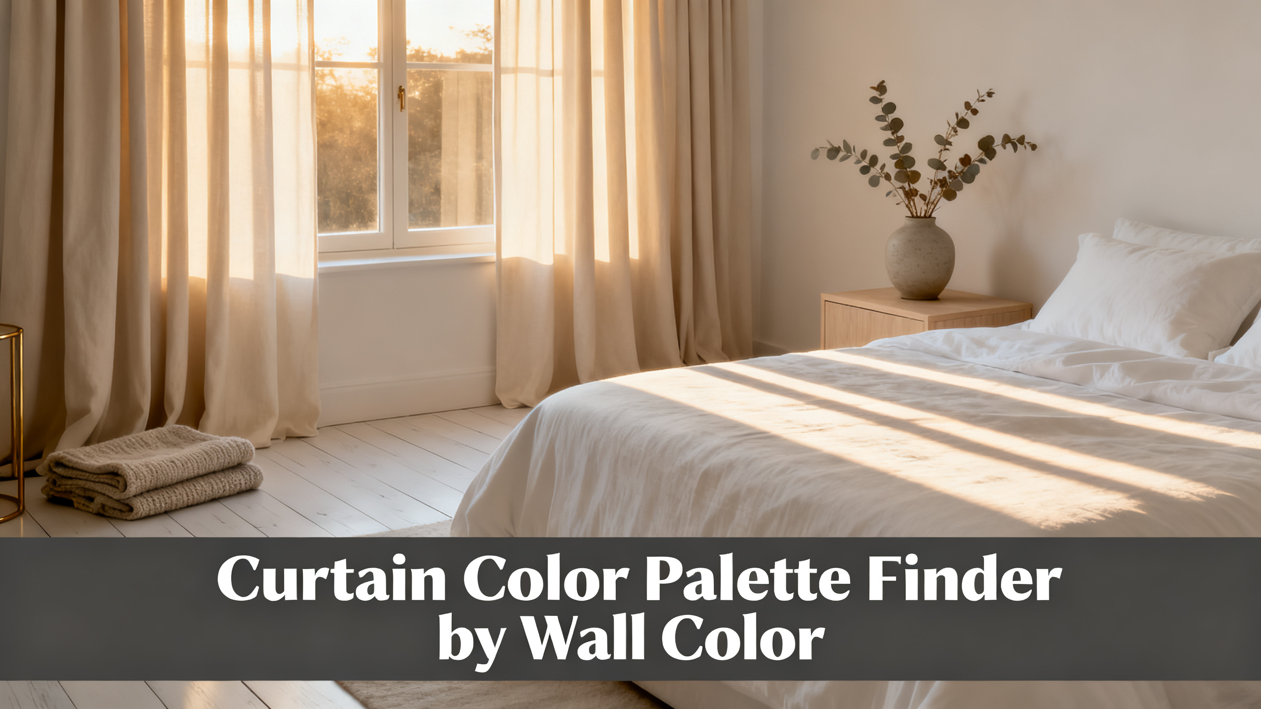
Owners land on a curtain color palette finder for one of three reasons. They know the wall color and want a curated 3 to 5 shade shortlist. They only have a paint chip and no framework. Or they have curtain colorways in mind and want the reverse compatibility check against their wall.
The finder below covers all three paths, and the prose around it walks the 4-angle framework the tool applies so nothing gets picked on hue alone. The palette finder covers the 14 most-searched wall colors, and the full curtain color pairing hub adds the finish-by-finish and room-by-room breakdowns.

Where the palette finder output ships to
Liz Linen Drape Pleated
from $59/panel · 90% polyester / 10% linen · 350 gsm · 38 colorways covering every wall undertone (warm ivories, cool greiges, deep charcoals, saturated navies, muted sages) · pinch pleat header · custom to 1/2 inch. Final price depends on size and lining.
Use code JULY for 20% off · Free shipping over $300
The Palette Finder (Pick Your Wall, Get Your Curtain Shortlist)
Here is what the finder does with your wall input. Three fields in, one shortlist out. Pick the closest wall color, tell the tool whether the wall reads warm, cool, or neutral, and set the room mood you are targeting. The output returns 3 to 5 curtain shades mapped to Liz Linen colorway names, plus a header and lining note for each.
🎨 Curtain Color Palette Finder
Ivory White
warm · pinch pleat
Sand Beige
warm · pinch pleat
Grey Beige
neutral · privacy lining
Charcoal
cool · blackout lining
Shortlist recalibrates on every input change. Screen color is directional. Order the $3.99 booklet to verify in daylight.
🎨 The 8 archetype curtain shades (click through to the matching wall guide)
The finder returns a shortlist, but the logic behind that shortlist is 4 angles worth walking. Skip the framework and the finder is a black box. Read it and you can extrapolate to any wall, including the ones the dropdown does not cover.
The 4-Angle Framework the Finder Applies
Undertone
Undertone is the temperature bias underneath the surface color. According to the Pantone undertone fundamentals, most residential wall paints carry either a warm undertone (yellow, red, or orange bias) or a cool undertone (blue, green, or purple bias). Neutral undertones exist but are rarer than paint marketing suggests.
If your wall is warm neutral, warm curtain reads intentional. Cool curtain on warm wall reads mistake. A beige-plaster wall with a pink undertone pairs with an Ivory White Liz Linen colorway that holds warmth in the fold shadow. Drop a cool Snow White in front of the same wall and it reads dirty by 4pm daylight.
How to Choose Curtain Color: The Full Decision Framework
The finder applies the 4-angle framework in one click. The full guide walks each angle with worked examples across every wall undertone, plus the trap questions most owners skip before they order.
The 4-angle framework
🎨
Undertone
Match warm to warm, cool to cool. Cross undertones read as color mistakes at 4pm daylight.
🔳
Contrast
2 to 3 shades apart is the default. Match wins only in small rooms and low ceilings.
🌈
Saturation
Saturated walls take muted curtains. Muted walls take saturated curtains. Never both loud.
💡
Function
Blackout linings shift perceived hue by 3 to 8 percent. Factor lining before locking color.
Contrast
Real talk on matching curtain to wall. It works in 3 rooms and it fails in 12. Match wins when the room is under 120 square feet, when the ceiling is under 8 feet, or when you are building a minimalist bedroom where you want the wall to read as a single continuous plane behind the bed. In every other case, 2 to 3 shades of separation reads more expensive.
The contrast ladder below shows what each step does to perceived room size. Below one shade of separation, the drape reads as painted-on wallpaper. Above 6 shades, it reads as a costume choice. The default target is step 3, which is what the finder returns by default when you set mood to Contrast.
Should Curtains Match Wall Color?
Short answer: rarely. The FAQ deep-dive covers the 3 cases where match wins (small rooms, low ceilings, minimalist bedrooms) and the 12 cases where 2 to 3 shades of contrast reads more expensive.
Contrast ladder (shade separation vs perceived room size shift)
0 shade
Monochrome. Reads as painted wall. +8% perceived size in rooms under 120 sqft.
1 shade
Tone-on-tone. Subtle frame effect. +4% perceived size.
2 to 3 shades
The default. Drape reads as intentional frame. Neutral perceived size.
4 to 5 shades
Statement. Ceiling reads lower by 4%. Wall recedes.
6+ shades
High-drama. Reads costume unless paired with matching hardware. Not the default.
Saturation
Saturation is separate from value. A pastel and a jewel tone can share the same value (lightness) but differ dramatically in chroma. The rule the finder applies: saturated walls take muted curtains, muted walls take saturated curtains, and never both loud.
Worked example. A navy feature wall (high saturation, low value) pairs with Sand Beige Liz Linen (low saturation, high value). Reverse the pairing and you get a cream wall with a navy drape, which is a stronger statement but the same principle applied inverted. Both directions work. The failure mode is a saturated wall with a saturated curtain in a competing hue: teal wall plus terracotta curtain will read like a paint chip fight.
Wall tone cheat sheet
Warm walls
Warm curtains: Ivory White, Warm White, Sand Beige, Oat, Beige White, Dune.
Cool walls
Cool curtains: Snow White, Dove, Dusk Blue, Sage, Charcoal, Navy.
Neutral walls
Both directions work. Contrast level decides. Match for calm, 2 to 3 shades for the default.
Function
Function is the angle most owners miss. The Two Pages fabric guidance notes that lining choice shifts perceived curtain hue: blackout linings absorb 3 to 8 percent of the light that would otherwise bounce through the face fabric, which mutes warm ivories toward neutral and holds deep navies and charcoals better.
Thermal linings sit in the middle at roughly 5 to 10 percent opacity shift. Privacy linings are the closest to no shift, which is why the finder recommends privacy for the lighter Liz Linen colorways and blackout only where the shift is welcome (Navy, Charcoal). The lining decision re-enters the palette equation before you order.

Your Palette Lands in the Liz Linen Range
The finder returns 3 to 5 curtain shades. In 9 of 10 cases those shades exist inside the 38-color Liz Linen colorway: ivory, snow white, warm white, beige, greige, sand beige, oat, dune, sage, olive, dusk blue, navy, charcoal, and 25 more. Same 140 gsm linen blend, same pinch pleat header, custom to the half inch on width and drop.
The 14-Wall Color Directory
Fourteen wall color queries account for roughly 85% of the cluster search demand in the curtain color space. The table below is the finder output surfaced as a static reference, one row per wall color with recommended curtain shades, header match, lining note, and a deep-dive link.
Every row links to a full deep-dive. The beige wall breakdown is the most-visited entry point in the cluster because beige walls sit in the middle of the undertone distribution and confuse the most shoppers.
| Wall Color | Undertone | 3 Curtain Shades | Header | Lining | Deep-dive |
|---|---|---|---|---|---|
| White | Neutral | Ivory, Snow, Grey Beige | Pinch pleat | Privacy | Read |
| Off-white | Warm | Ivory, Warm White, Beige White | Pinch pleat | Privacy | Read |
| Cream | Warm | Warm White, Beige White, Sand Beige | Pinch pleat | Privacy | Read |
| Greige | Neutral | Ivory, Grey Beige, Charcoal | Ripple fold | Thermal | Read |
| Beige | Warm | Ivory, Warm White, Sand Beige | Pinch pleat | Privacy | Read |
| Tan | Warm | Ivory, Sand Beige, Beige White | Pinch pleat | Privacy | Read |
| Gray | Cool | Snow, Dusk Blue, Charcoal | Grommet | Blackout | Read |
| Navy | Cool | Ivory, Sand Beige, Dove | Pinch pleat | Privacy | Read |
| Blue | Cool | Snow, Dove, Dusk Blue | Grommet | Privacy | Read |
| Green | Cool | Snow, Dove, Sage | Ripple fold | Privacy | Read |
| Sage | Cool | Ivory, Warm White, Sand Beige | Pinch pleat | Privacy | Read |
| Black | Neutral | Ivory, Sand Beige, Warm White | Pinch pleat | Privacy | Read |
| Brown | Warm | Ivory, Warm White, Sand Beige | Pinch pleat | Privacy | Read |
| Pink | Warm | Ivory, Warm White, Sand Beige | Pinch pleat | Privacy | Read |
Room Moods That Rewrite the Palette
Same wall, same undertone, mood shift, different shortlist. A greige wall with a calm mood returns Ivory White (tone-on-tone). Same greige with a dramatic mood returns Charcoal. Same greige with a coastal mood returns Dusk Blue. The finder rewrites its output on mood change; the mood board cards below show the archetypes.
5 room moods, 5 palette outputs
Calm neutral bedroom
Warm White wall + Ivory Liz Linen. Pinch pleat, privacy lining.
High contrast living
Greige wall + Charcoal Liz Linen. Ripple fold, blackout lining.
Coastal soft
Snow White wall + Dusk Blue Liz Linen. Grommet, privacy lining.
Dramatic dark
Charcoal wall + Navy Liz Linen. Pinch pleat, blackout lining.
Cozy warm nursery
Warm White wall + Oat Liz Linen. Pinch pleat, blackout lining.
The mood cards are not decorative. Each one is a full palette recipe that maps to the finder output above. If your room already sits close to one of these five archetypes, the finder is going to hand back a similar shortlist.
What to Do with Your Palette
Move the shortlist into the Liz Linen product page color picker. All 38 colorways are the same 140 gsm linen blend, so the material specs stay constant across your shortlist. What changes between shades is the hue, the perceived weight (darker shades read heavier), and the lining recommendation.
Curtain Size Calculator (Free Tool)
Color chosen. The size calculator returns exact panel width, drop, and count from your rod width and header type, ready to enter into the Liz Linen custom order form.
The color swatch matrix below is the checkpoint before you order. Three wall undertones, four recommended shades per undertone, twelve Liz Linen colorways covering the safe zone. If your shortlist landed in a cell of the matrix, the pairing has been vetted against undertone, contrast, saturation, and function all at once.
Color swatch matrix (wall undertone × Liz Linen colorway)
Warm walls
Ivory White
Warm White
Sand Beige
Oat
Cool walls
Snow White
Dove
Dusk Blue
Charcoal
Neutral walls
Ivory White
Beige White
Grey Beige
Navy

Screen Palette to Wall Palette in $3.99
The palette above is calibrated on your screen, not your wall. Every monitor shifts warm and cool by 5 to 15 percent. The Liz Linen Blend Booklet ships all 38 colors on the actual 140 gsm fabric for $3.99. Pin the 3 shortlisted swatches next to your wall paint chip in daylight, then order.
3 Color Mistakes That Break the Palette
Where the finder cannot save you: wrong assumptions on your side. Sounds obvious. Screen-shoppers still get this wrong at a rate closer to 1 in 3 according to Two Pages return data on color-only returns. The three below account for the majority.
3 mistakes that break the palette
⚠️ Picking from screen only
Every monitor drifts 5 to 15% warm or cool. Never lock a color from screen without a daylight swatch check first.
⚠️ Ignoring lining hue shift
Blackout linings pull warm ivories toward neutral by 3 to 8%. Pick lining before locking color, not after.
⚠️ Matching to wall, not trim
Trim carries the strongest hue reference in the room. Match curtain to trim before wall for a cleaner architectural read.
Palette Locked. Order to It.
The finder returns 3 to 5 shades. Two clicks route from here: either the Liz Linen custom order form for the panels in those shades, or the wider curtain color pairing hub if you want to zoom out to room type or finish first. Everything else is confirmation swatch checks in daylight and header choice.
Palette Locked. Now Confirm in Daylight.
Liz Linen Drape Pleated ships in 38 colors matched against every wall undertone the finder covers. from $59/panel, 350 gsm, pinch pleat header, custom to the 1/2 inch. Code JULY (20% off) · Free shipping over $300 · lead time 3 to 4 weeks handcrafted. Or return to the full curtain color hub for the 14 wall-by-wall breakdowns.
FAQ
What is a curtain color palette finder?
A curtain color palette finder is a tool that converts wall color, wall undertone, and room mood into a shortlist of 3 to 5 recommended curtain shades. It applies the 4-angle framework (undertone matching, contrast ladder, saturation balance, function via lining) automatically, so you never have to hold a paint chip against 38 fabric swatches by trial. The finder on this page does that in under 3 seconds and returns Liz Linen colorway names ready to order.
How do I match curtain color to wall color?
Match on undertone first, then choose a contrast level. Warm walls (beige, cream, tan, warm gray) take warm curtains (ivory, oat, sand, dune). Cool walls (blue-gray, greige with a cool bias, sage, navy) take cool curtains (snow white, dove, dusk, charcoal). Then set contrast 2 to 3 shades apart for the default, tighter for small rooms, wider for statement walls.
Should curtains match the wall color exactly?
Rarely. Exact match works in 3 cases: small rooms where visual continuity stretches perceived size, low ceilings where contrast breaks the vertical line, and minimalist bedrooms where you want the wall to read as a single plane. In the other 12 cases, 2 to 3 shades of separation reads more expensive and lets the drape act as a frame rather than a wallpaper extension.
What curtain color goes with beige walls?
Beige walls take ivory, snow white, warm white, sand beige (tone-on-tone), or a saturated navy for contrast. The exact pick depends on the beige undertone: pink-beige takes warm ivory, yellow-beige takes crisp warm white, gray-beige (greige) opens to cool options too. Liz Linen colorway coverage: Ivory White, Snow White, Warm White, Beige White, Sand Beige, Navy.
What curtain color goes with gray walls?
Gray walls split on undertone. Cool gray (blue bias) takes snow white, dove, dusk blue, charcoal. Warm gray or greige takes ivory, oat, sand beige, warm white. Universal picks that work across both bias types: charcoal for high contrast, ivory for soft frame. Match the room mood: dramatic goes charcoal, calm goes ivory.
Do blackout linings change the curtain color?
Yes. Blackout linings shift the perceived curtain hue by 3 to 8 percent toward neutral because the opaque backer absorbs the light that would otherwise bounce back through the face fabric. Warm ivories read slightly cooler with blackout backing. Deep navies and charcoals hold color better. The finder outputs a lining recommendation for this reason.
How accurate is the palette finder on my screen?
The color chips displayed by the finder use calibrated hex values, but every monitor drifts warm or cool by 5 to 15 percent. The finder is directional, not final. That is why the swatch booklet CTA exists: $3.99 ships all 38 Liz Linen colorways on the actual 140 gsm fabric so you pin the shortlist next to your wall paint chip in real daylight before ordering.
What if my wall color is not in the finder dropdown?
The finder covers the 14 most-searched wall colors plus a custom hex input path. If your wall is a niche color (terracotta, dusty rose, olive green, mustard, teal), use the closest neighbor plus a manual undertone override in the finder. The 4-angle framework in the section above covers the logic to extrapolate to any wall, and the full curtain color pairing hub covers the rare colors in dedicated deep-dives.
