
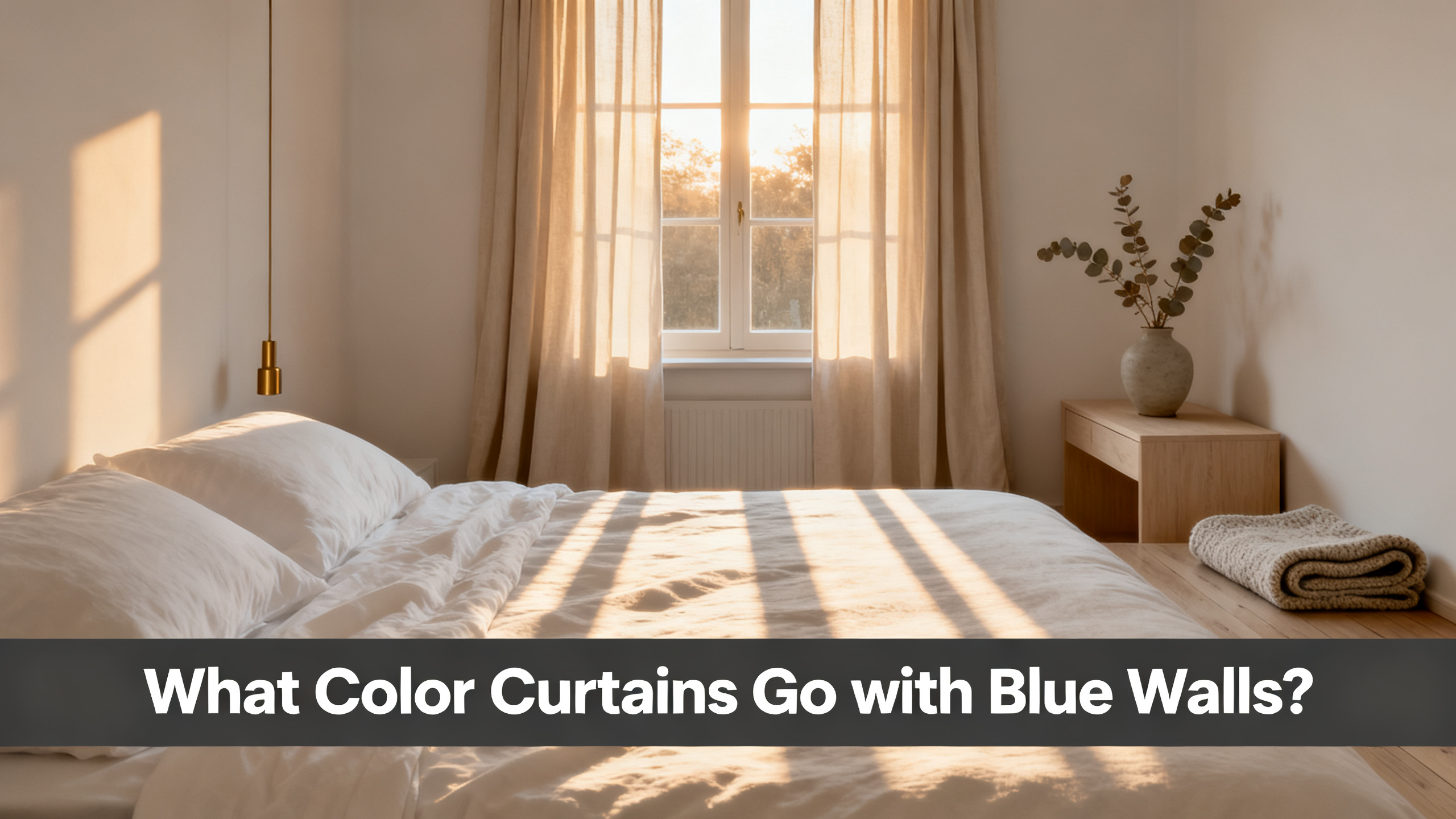
Warm neutrals win. Sand Beige 1908-3, Ivory, Burlywood Birch and Fog from the Liz Linen Blend collection flatter blue walls on 4 out of 5 nuances. The one exception is slate blue, where a cool grey neutral edges the warm palette out.
That is the whole verdict. The rest of this guide is the reasoning, a nuance-by-nuance breakdown across 5 blue wall families, the three pairings I would steer you away from, and the swatch protocol that saves the $59 to $199 panel from becoming a regret. Everything downstream lives in the full curtain color hub for every wall nuance.
Answer-First Verdict
The 5 curtain colorways that answer blue walls:
🎨 Sand Beige 1908-3 · warm neutral, wins on powder + sky + navy (quiet path) + teal
🎨 Ivory 1908-1 · warm off-white, softens navy and cobalt without going clinical
🎨 Fog 1908-18 · cool neutral, the one pick that beats warm on slate blue
🎨 Burlywood Birch 1908-5 · warm mid-tone, balances teal’s green bias
🎨 Grey Beige 1908-6 · warm-cool hybrid, the flex pick when the blue reads ambiguous

The Panel That Flatters Blue Walls On 4 Of 5 Nuances
Liz Linen Blend Drapery Pleated · Sand Beige 1908-3
from $59/panel · 140 gsm linen blend · 38 colorways including Sand Beige, Fog, Ivory, Grey Beige · 9 header styles · 6 lining options. Final price depends on size and lining.
Use code JULY for 20% off sitewide · Free shipping over $300
The Three Rules Behind Every Blue-Wall Pairing
Two things to know before we get into the nuances. Every blue wall carries an undertone (warm or cool), and every blue is intrinsically a statement color. Those two facts drive the three rules that decide 90 percent of the pairing.
Rule 1: match the undertone, not the hue. A warm-undertone blue like Benjamin Moore Van Deusen wants a warm curtain neutral. A cool-undertone blue like Sherwin-Williams Naval wants a cool curtain neutral. The Sherwin-Williams color psychology reference confirms that mismatched undertones read as “off” even when the buyer cannot name why.
How to Choose Curtain Color: The 5-Criterion Framework
Blue walls are one wall. The full color framework covers undertone, contrast, room function, light exposure and saturation tolerance across every wall color.
Rule 2: keep the curtain quieter than the wall. Blue already commands attention. A curtain that competes at the same saturation reads as visual noise. The curtain’s job on a blue wall is to frame, not to argue.
Rule 3: elongate the room to compensate for blue’s visual weight. Saturated blue makes ceilings feel lower by roughly one foot equivalent. Panels hung at the right curtain length, floor to ceiling, with the rod 4 to 6 inches wider than the frame, give that height back.
The Three Rules · At A Glance
Rule 1
🌡️ Match Undertone
Warm blue → warm neutral (Sand Beige). Cool blue → cool neutral (Fog).
Rule 2
🔉 Keep The Curtain Quiet
Blue is loud enough. The curtain frames, it does not argue.
Rule 3
📏 Elongate The Room
Floor to ceiling, rod 4-6 in wider than frame. Blue’s weight demands it.
The 5 Blue Wall Nuances (And What Each One Wants)
Blue is not one color. Sounds obvious. Here’s why it’s not: what buyers call “blue walls” fractures into 5 distinct nuance families, each with a different color rule attached. Get the family right and the curtain color follows.
Blue Wall Nuance Palette · Which Curtain Colorway Wins
Powder Blue
Sand Beige 1908-3
Sky Blue
Ivory 1908-1
Slate Blue
Fog 1908-18
Cobalt / Navy
Ivory or Rust Statement
Teal
Burlywood Birch 1908-5
Powder Blue Walls (Warm Neutrals Take The Lead)
Powder blue is pale, saturation low, with a slight cool bias. It reads soft, feminine, and vulnerable to being drained by the wrong curtain. The Benjamin Moore blue color family catalogs a dozen variations here, all in the same LRV band.
The pick that flatters powder blue on 8 out of 10 rooms is Sand Beige 1908-3. It adds warmth without darkening the wall. Burlywood Birch 1908-5 is the mid-tone alternative for a bedroom that wants a touch more grounding.
Sky Blue Walls (Warm Ivory Softens The Coolness)
Sky blue is one saturation step above powder blue, still cool but with more visual presence. Living rooms with south-facing light show sky blue at its warmest. Ivory 1908-1 and Snow White 1908-0 in the Liz Linen Blend soften the coolness without going clinical the way pure white does.
Direction Card · Pale Blue vs Deep Blue
Pale Direction (Powder + Sky)
Warm Neutrals Add What The Wall Lacks
Pale blue reads under-saturated. A warm curtain balances the coolness without competing. Cool neutrals drain the room.
Deep Direction (Cobalt + Navy)
Two Paths: Whisper Warm Or Statement Deep
Path 1: Ivory lets the wall dominate. Path 2: a saturated Birkin Velvet Rust converses with the navy for a designer look.
Slate Blue Walls (Cool Neutrals Match The Cool Wall)
Slate blue is the exception to the warm-neutral rule. It carries a franc cool undertone (grey-blue at mid saturation), and matching cool-on-cool actually beats warm-on-cool here. Fog 1908-18 and Grey 1908-11 are the two Liz colorways that hold their own next to slate blue.
If it were my own bedroom with slate blue walls, the pick I would tape first is Fog 1908-18. Sand Beige clashes slightly, reading yellow next to the wall’s cool grey undertone.
Cobalt / Navy Walls (Two Paths: Whisper Warm Or Statement Deep)
Cobalt and navy are the deep end. The wall becomes the dominant visual element in the room. Two paths win, and they go in opposite directions.
Path 1: quiet warm neutral. Ivory 1908-1 or Sand Beige 1908-3 lets the navy stay the star. This is the safest pick for a living room where the wall is meant to be the accent. Path 2: statement deep. A saturated colorway like Birkin Velvet Rust 3402-14 converses with the navy for a luxury designer look.

Slate Or Navy Walls? Fog 1908-18 Is The Cool-Neutral That Doesn’t Compete.
from $59/panel · Fog reads as a soft cool grey next to slate blue and as a whisper cream next to true navy. Two rooms, one panel line, no clash. Swatch it against your wall before the panel commit.
Teal Walls (Warm Mid-Tone Neutrals Balance The Green Bias)
Teal is blue with a green shift. The green bias throws off both warm and cool neutrals if you don’t compensate. Burlywood Birch 1908-5 and Grey Beige 1908-6 in the Liz Linen Blend carry enough warm mid-tone to balance the green without competing on saturation.
Do Beige, White, Or Grey Curtains Go With Blue Walls?
The three most-searched pairings, all answered in one sentence each. Then the nuance.
Beige
✅ Yes (with undertone match)
Warm beige on warm blue. Cool beige on cool blue. Two beiges never match under LED. Best pick: Sand Beige 1908-3.
White
✅ Yes (warm off-white only)
Pure gallery white reads clinical against saturated blue. Warm ivory blends softer. Best pick: Ivory 1908-1.
Grey
⚠️ Yes on slate + cobalt only
Cool undertones align on slate blue. On powder blue, grey drains the warmth. Best pick: Fog 1908-18.
Beige works when the undertone aligns. Warm beige against a warm-undertone blue (Van Deusen), cool beige against a cool-undertone blue (Naval). Two beiges look identical in a studio and clash under LED lighting, which is the honest reason color regret happens.
White is the trickiest. Pure bright white risks reading clinical against saturated blue walls, especially in living rooms with cool north light. Warm off-white (Ivory 1908-1) or Snow White 1908-0 blend softer. In a bedroom, layering a sheer under the color panel gives you the softness of white without the harsh contrast.
Grey is a conditional yes. On slate blue and cobalt walls it works because the cool undertones align. On powder blue and sky blue it often flattens the room by draining warmth from the wall.
Small Blue Rooms And The Contrast Trap
A saturated blue wall shrinks a small room by roughly 15 percent visually. In a room under 120 square feet, that shrink becomes claustrophobic within a week. The two levers that give the space back are rod placement and low-contrast curtain color.
How to Make a Small Room Look Bigger with Window Treatments
A saturated blue wall shrinks a small room by 15 percent visually. Rod placement and low-contrast curtain color are the two levers that give it back.
The verdict for a small blue room: Snow White 1908-0 or Sand Beige 1908-3 hung floor to ceiling, rod 4 to 6 inches wider than the frame each side. Never a dark curtain in a small blue room. The double-weight of dark curtain plus saturated wall closes the room in.
3 Blue Wall Pairings To Skip
Now, the three pairings I would steer you away from. Each looks defensible in a mood board and falls apart in the actual room.
Skip 1: cool grey curtain on warm powder blue wall. The undertone clash reads as “off” from across the room. The buyer usually cannot name the problem, only that the room does not feel right.
Skip 2: pure black curtain on cobalt wall. The visual weight doubles. What was a rich accent wall becomes an oppressive box. Charcoal is fine. Ebony is fine at long drops in large rooms. Pure jet black is not.
Skip 3: saturated red or orange curtain on navy wall. Complementary colors on the color wheel, disaster in an actual living room. The two saturations fight for attention and the room reads chaotic.
⚠️ Important: Two beiges never match under LED. A warm beige curtain against a warm-undertone blue wall (Van Deusen) reads as harmonious. The same beige curtain against a cool-undertone blue wall (Naval) reads as muddy. Always swatch under your actual bulbs before ordering the panel.
Every one of these skip-list pairings looks defensible in a mood board and terrible in the actual room. The fix is not more Pinterest research. It is a $3.99 booklet.
The Swatch Protocol For Blue Walls (9am, 4pm, 24 Hours)
Picture your Sand Beige swatch backlit by 9am cool morning light, then again at 4pm warm afternoon light, against the same blue wall. The color shifts. Sometimes dramatically. Blue walls swing farther between morning and afternoon than any other wall color family.
Swatch Testing Protocol · Blue Walls
Step 1
🧵 Order Booklet
Liz 38-color booklet ships for $3.99 in 3-5 days.
Step 2
🌅 Observe At 9am
Cool morning light. Note which swatch holds its warmth.
Step 3
🌇 Observe At 4pm
Warm afternoon light plus LED bulbs on. Undertone shifts show now.
Step 4
⏳ Wait 24 Hours
Never decide the same day. Sleep on it. Decide the next morning.
Hold The Colorway Against Your Actual Blue Wall Before Committing.
The Liz Linen Blend Booklet ships all 38 colorways flat for $3.99. Blue walls shift dramatically under morning cool light versus afternoon warm light, and a swatch decides in 90 seconds what studio photos cannot.
The math on the booklet is worth stating plainly. $3.99 for the booklet versus $59 to $199 for the finished panel. That is a 2 to 7 percent risk premium to eliminate a regret that hits roughly 1 out of 4 blue-wall buyers who skip the step. The booklet pays for itself before it arrives.
Persona Picks (Renter, First-Home Owner, Luxury Designer)
Same blue wall, three buyers, three different picks. Here is where the framework becomes a purchase.
Persona Fit · Blue Wall Picks
Renter
🔑 Sand Beige 1908-3
Warm neutral that follows through 2 to 3 apartments. No lining upgrade needed. from $59/panel.
First-Home Owner
🏠 Burlywood Birch 1908-5
Warm mid-tone with cotton flannel lining. Survives one wall repaint and one sofa swap.
Luxury Designer
🎨 Birkin Velvet Rust 3402-14
Statement deep with blackout lining, 108″ drop. The Path 2 designer play on a navy accent wall.
Sand Beige, Ivory, Fog, Burlywood Birch, and Grey Beige answer 4 of 5 blue-wall nuances between them, with slate blue as the one exception where Fog edges out the warm palette. Everything else in this article is refinement of that single sentence. Order the swatch booklet before the panel. That is the whole playbook.
Blue Wall Meets Warm Neutral Panel. That’s The Whole Story.
Liz Linen Blend Drapery Pleated in Sand Beige, Ivory, Fog or Grey Beige answers 4 of 5 blue-wall nuances. from $59/panel, 140 gsm, 38 colorways, 9 headers, 6 linings. Code JULY (20% off sitewide) · Free shipping over $300 · handcrafted 3-4 week lead time. For the full wall-by-wall color pairing map, the hub keeps every nuance in one place.
Frequently Asked Questions
What color curtains go best with blue walls?
Warm neutrals lead: Sand Beige 1908-3, Ivory, and Burlywood Birch 1908-5 from the Liz Linen Blend collection flatter powder blue, sky blue, and teal walls. Slate blue is the exception, where Fog 1908-18 (a cool neutral) edges out the warm palette.
Cobalt and navy walls tolerate both a quiet warm neutral (Sand Beige) and a statement deep (Birkin Velvet Rust 3402-14), depending on whether you want the wall to dominate or to converse with the curtain.
Do beige curtains go with blue walls?
Yes, when the beige undertone matches the blue wall’s undertone. A warm beige (Sand Beige 1908-3) works against a warm-undertone blue like Benjamin Moore Van Deusen. A cool beige (Greige 1908-8) works against a cool-undertone blue like Sherwin-Williams Naval.
Two beiges look identical in a studio and clash under LED lighting, so swatching is non-negotiable.
Do white curtains go with blue walls?
Pure bright white risks reading clinical against saturated blue walls, especially in living rooms. A warm off-white (Ivory 1908-1) or Snow White 1908-0 blends softer. On powder blue and sky blue walls, warm ivory is safest. On cobalt or navy, warm ivory reads as elegant contrast.
Skip pure gallery-white curtains: the contrast reads harsh.
Do grey curtains go with blue walls?
On slate blue and cobalt walls, yes, because the cool undertones align. Fog 1908-18 and Grey 1908-11 are the safest picks. On powder blue and sky blue, grey curtains often flatten the room by draining warmth from the wall.
If the powder blue reads warm, choose a warm neutral instead. If it reads cool, a soft grey can work with a warm accent element (rug, lamp) in the room.
What color curtains go with navy blue walls?
Two directions win. Path 1 (quiet): Ivory 1908-1 or Sand Beige 1908-3 lets the navy wall dominate as an accent wall. Path 2 (statement): a saturated colorway like Birkin Velvet Rust 3402-14 or Emerald converses with the navy for a luxury designer look.
Skip pure black (visual weight doubles), skip warm orange (theoretically complementary, practically loud), and skip cool grey (undertone drain).
What color curtains go with light blue or powder blue walls?
Warm neutrals lead. Sand Beige 1908-3, Burlywood Birch 1908-5, and Ivory 1908-1 add warmth without competing with the pale wall. Avoid pure white (drains the softness) and avoid cool grey (flattens the room).
In bedrooms with south-facing light, warm neutrals feel envelopping. In north-facing rooms, Ivory reads more grounded than Snow White.
Should curtains be lighter or darker than blue walls?
On saturated blue walls (cobalt, navy, teal), curtains should be significantly lighter to keep the room from feeling boxed in. Ivory, Sand Beige, or Fog work best.
On pale blue walls (powder, sky), curtains can match value roughly (low-contrast monochromatic look) or go slightly darker with a warm mid-tone like Burlywood Birch. Same value equals harmonious background. Higher contrast equals statement wall.
Do the same rules apply to blue accent walls or full blue rooms?
Mostly, with one adjustment. On a single accent wall painted blue, the other three walls dilute the visual weight, so a warm neutral curtain reads as elegant. In a full 4-wall blue room, the saturation of the wall increases in every peripheral vision angle, so a warm mid-tone (Burlywood Birch) or a whisper-light neutral (Snow White) prevents the room from feeling submerged.
Small blue rooms should always default to a light warm neutral.
