
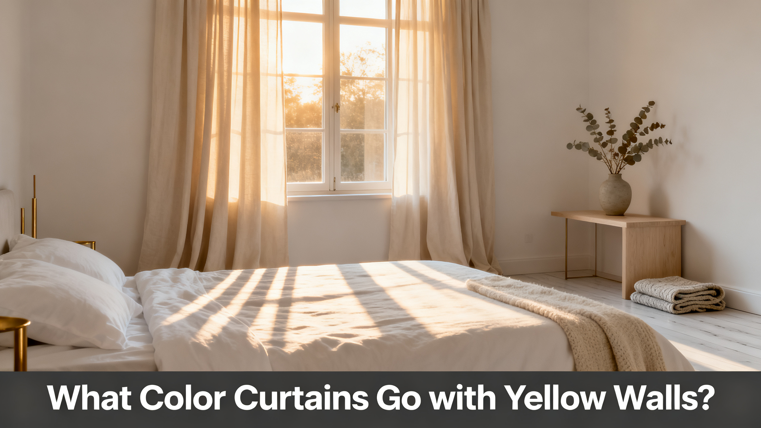
The five curtain colors that work with yellow walls are cool light grey (Liz Fog 1908-18), pure cashmere grey (1908-15), crisp snow white (1908-0), sage green, and navy blue as the designer complement (1908-36). Which of the five fits your room depends on how saturated the yellow reads and how much cool rebalance the space needs.
Yellow walls are polarizing because their chroma is already loaded. Butter yellow reads soft and forgiving. Saffron and mustard read intense and demand a cool counterweight. The four angles below (undertone, contrast level, light and function, persona picks) filter the safe range down to two or three real candidates for your specific room. If you want the parent framework behind every wall-color guide on the site, open the full curtain color pairing hub for the wall-by-wall breakdowns.
The one-sentence answer, five colorways at a glance
Question
Which curtain colors flatter a yellow wall without stacking the saturation or reading like a school lobby?
Safe range
1. Cool light grey (Fog 1908-18)
2. Pure cashmere grey (1908-15)
3. Snow white (1908-0)
4. Sage green
5. Navy blue (1908-36)

The flagship neutral for yellow walls
Liz Linen Drape Pleated
from $59.99/panel · 350 gsm heavyweight linen blend · 38 colorways covering cool greys, crisp whites and warm neutrals · 9 header styles · 6 lining options · OEKO-TEX Standard 100. Final price depends on size and lining.
Use code JULY for 20% off sitewide · Free shipping over $300
Curtain Colors That Work with Yellow Walls: The 4-Angle Deep-Dive
Angle 1: Read Your Yellow Wall’s Undertone First
Sounds obvious. Here’s why it isn’t: yellow is not one color. Butter yellow carries a pink-peach undertone. Saffron carries a red-orange undertone. Mustard carries a green-brown undertone. Chartreuse leans yellow-green. The Munsell hue-value-chroma notation puts most yellow walls between value 7 and 9 with chroma anywhere from 4 to 12. Two yellow walls that look identical in the paint aisle can sit ten degrees apart on the hue wheel and thirty percent apart in saturation.
The rule that gets you 90 percent of the way there: match your curtain undertone to your wall undertone, not to the nominal hue. A blue-biased cool grey like Liz Fog 1908-18 rebalances a saffron wall smoothly because it counters the red-orange bias. The same grey on a mustard-green wall pulls slightly cold and reads mismatched, even if both look “cool grey on yellow” in the studio.
What Color Curtains Go with Beige Walls?
If your wall reads more soft beige or greige than saturated yellow, the pairing math shifts toward warm-neutral tone-on-tone. The beige-wall guide covers that softer neighbor of the yellow family.
Butter vs saffron yellow diagnostic (four tests each side)
🧈 Butter / Soft Yellow (pink-peach bias)
1. Wall looks slightly peach next to raw white paint.
2. Wall shifts creamy amber at 4pm under warm LED.
3. Warm wood trim looks harmonious, not clashing.
4. Reads butter, cream-yellow, daffodil, primrose.
🌶️ Saffron / Mustard (green-brown or red bias)
1. Wall looks slightly orange or ochre next to raw white.
2. Wall reads intense under morning light, floods the room.
3. Warm wood trim clashes visibly against the wall.
4. Reads saffron, mustard, ochre, turmeric, honey.
Liz colorways sit across the yellow-wall undertone axis in a way that lets you match at a glance. Fog 1908-18 reads cool light grey with a blue bias, the safest rebalance for saturated walls. Pure Cashmere Light Grey 1908-15 reads soft cool neutral, gentler than Fog. Snow White 1908-0 reads crisp white, best on soft butter yellow where added brightness lifts the room. Grey Beige 1908-6 bridges warm and cool with a neutral undertone that flatters both butter and mustard. Beige White 1908-1 reads warm tone-on-tone soft, closer to the wall itself than to a contrasting neutral.
Color pairing matrix: yellow wall type × curtain colorway
⚠️ Important: The single most common yellow-wall mistake is buying a bright canary-white curtain for a saffron wall that already reads at maximum saturation. Both stack the intensity and the room reads like a school lobby. Always swatch under your actual bulbs at 4pm before committing.
Real talk: if it were my own kitchen with butter yellow walls, I’d swatch three cool greys and three warm whites side by side against the wall at 4pm before ranking any. The colorway that calms the wall is the safe pick. The one that stacks intensity or fights the wall is the one to avoid, no matter how good it looked in the paint aisle.
Angle 2: Pick a Contrast Level (and Skip the Mustard-on-Butter Trap)
Contrast on yellow walls is value distance plus chroma distance. Yellow walls sit high on the chroma scale (usually 4 to 12 on a 0-16 scale), so the visual math is already loaded before you add any curtain. Every choice you make either doubles the intensity or counters it.
Four contrast tiers work on yellow walls. Cool tone-down (curtain 2 to 3 values cooler than wall) reads calming and is the everyday safe pick. Neutral bridge (grey beige, seamless transition) reads restrained. Warm tone-on-tone soft (Beige White at low chroma) reads cozy on butter yellow only. High complement (navy blue on the color wheel opposite) reads intentional statement. There’s a fifth tier that almost never works: same-family same-value (mustard curtain on butter wall). It reads muddy every single time.
How to Choose Curtain Color: The Buyer Framework
Undertone, contrast, room function, light and saturation tolerance: the 5-criterion decision framework behind every wall-color guide on the site.
| Curtain Color | Contrast | Undertone Match | Best Room | Two Pages Colorway | Verdict |
|---|---|---|---|---|---|
| Cool light grey | Tone-down (2-3 values cooler) | Saffron, mustard, chartreuse | Bedroom, office, living | Liz Fog 1908-18 | Everyday safe pick |
| Snow white | Bright lift (3-4 values off) | Butter, soft yellow only | Kitchen, sunroom, bath | Liz Snow White 1908-0 | Fresh and airy |
| Sage green | Split-complement | Butter, peach-yellow only | Living, dining, nursery | Liz Green 1908-30 | Statement, earthy calm |
| Navy blue | Full complement (opposite) | Butter or saffron, 9ft+ ceilings | Dining, formal living | Liz Navy Blue 1908-36 | Bold and intentional |
| Warm cream | Tone-on-tone soft (butter only) | Butter yellow only | Bedroom, cozy living | Liz Beige White 1908-1 | Cozy, avoid on saffron |
Between us, the cool-grey tone-down move is the one I keep recommending to clients with saffron kitchens or mustard dining rooms. Birkin Velvet Grey MJ11-67 sits one to two values darker than most yellow walls, which is the range where grey reads intentional layering rather than fighting the wall. The 300 gsm short-pile velvet catches afternoon light in a way that mattes down the yellow saturation. A flat cotton in the same colorway would just wash out. If you want to see the exact colorway rendered against a wall, the Birkin Velvet Grey MJ11-67 product page shows the pile direction and drape. For pricing sanity check, cart simulation runs about $220 for a standard Birkin Velvet panel in Grey at 52 by 96 inches unlined.

The luxury tone-down play
Birkin Velvet Grey MJ11-67
from $89/panel · 300 gsm heavyweight polyester velvet · OEKO-TEX Standard 100 · matte short-pile finish · thermal and acoustic performance. Grey MJ11-67 lands one to two values darker than most yellow walls, which is the range where the pairing reads calming instead of loud.
⚠️ Important: Mustard or ochre curtains on butter yellow walls muddy the room instead of coordinating. Values sit too close and the eye reads it as one flat wash. If you want tone-on-tone yellow, keep the curtain at least 3 values apart from the wall or shift to a warm cream (Beige White 1908-1). Same-family same-value pairing is the trap that always dates.
Now, where a bright canary-white on a saffron wall falls flat: ceilings under 8 feet. Both surfaces already reflect at maximum, so stacking a bright neutral against a high-chroma yellow flattens the depth entirely. Save Snow White 1908-0 for butter-yellow rooms with 9-foot ceilings or more, and reach for Fog or Pure Cashmere Light Grey when the yellow reads saturated. Cool tone-down stays safe at any ceiling height. Neutral bridge is the everyday pick if you don’t want to overthink it.
Angle 3: Light Exposure and Room Function Change the Answer
Yellow walls reflect 20 to 30 percent more light than a mid-value neutral wall. That amplification compounds through the day, which means light exposure matters twice as much on yellow walls as it does on beige or grey walls. The Sherwin-Williams color psychology reference on warm saturated hues flags yellow as the hue that reads different in each of the four compass directions and shifts hardest between morning and dusk.
The rebalance rule: north-facing yellow room needs a warm neutral (Beige White 1908-1, Grey Beige) to preserve some warmth without pushing it further. South-facing yellow room needs a cool grey (Fog 1908-18, Pure Cashmere) to counter the double-saturation stack. East-facing = neutral bridge (Grey Beige) that handles both warm AM and cooler PM. West-facing = UV-tolerant deep colorway or a layered sheer to soften the intense 4pm sun.
How to Layer Sheers and Drapes Like a Designer
Yellow walls amplify light. A cool white linen sheer under a grey drape softens the saturation by 20 percent perceived intensity without changing the color scheme.
Best Liz colorway for a yellow wall, by facing direction
🧭
North
Cool blue light.
Beige White 1908-1
☀️
South
Warm yellow light.
Fog 1908-18
🌅
East
Warm AM, cool PM.
Grey Beige 1908-6
🌇
West
Intense PM sun.
Pure Cashmere + sheer
Room function narrows the pick further. Living room yellow walls tolerate mid-cream or sage green easily. Bedroom yellow walls need a cool-grey colorway with a blackout or cotton flannel lining for sleep quality (Fog 1908-18 with blackout is my default). Dining room yellow walls flatter navy blue complement for the evening mood shift. Home office yellow walls demand cool neutrals (Fog, Pure Cashmere Light Grey) to avoid the focus fatigue that a fully warm yellow room causes after two hours of screen work. Panels hung floor to ceiling at the right length add another 10 to 15 percent perceived room height, which matters in low-ceiling yellow rooms specifically.
Room function pairing on yellow walls
🛋️
Living
Pure Cashmere 1908-15 or Sage. Cool tone-down or split-complement.
🛌
Bedroom
Fog 1908-18 with blackout lining. Cool light for sleep quality.
🍽️
Dining
Navy Blue 1908-36 complement. Formal evening drape.
💻
Office
Fog 1908-18 unlined. Cool light avoids focus fatigue.
Angle 4: Persona Picks (Renter, First-Home Owner, Luxury Designer)
The three preceding angles filter the safe range down to about eight colorways. The final pick depends on how long you’ll live with the yellow wall and how much you’re willing to spend per panel. Renter math is different from owner math is different from designer-with-a-client-budget math.
Picture your Fog swatch taped to the saffron wall at 4pm, west light hitting it sideways. If you’re a renter and you’ll move in 18 months, that’s your pick. Fog 1908-18 or Grey Beige 1908-6 follow you through two apartments without clashing with either the current yellow wall or the next neutral one. from $59.99/panel, no lining upgrade needed, unlined works. Same colorway also does most of the work if you want curtain tricks that visually expand a small room in a low-ceiling rental where the yellow already floods the space with warmth.
First-home owner with a painted yellow feature wall: you’re settling in for 8 to 10 years. Pure Cashmere Light Grey 1908-15 or Snow White 1908-0, low-mid contrast neutral, paired with a cotton flannel lining. The lining costs about $18 extra per panel and adds body and light control without going full blackout. Both colorways carry a neutral cool undertone that flatters the next paint refresh too, whenever you get to it.
Luxury designer with a saffron feature wall or a Sherwin-Williams Golden Fleece dining room: this is where Birkin Velvet earns the pricing. Birkin Velvet Grey MJ11-67 tone-down with blackout lining and a 108-inch drop for weight. from $89/panel base, plus lining and custom drop upgrades. The 300 gsm velvet pile absorbs yellow bounce and adds the visible depth a matte cotton would flatten into wallpaper. Or go full statement with Liz Navy Blue 1908-36 in a dining room with 10-foot ceilings, and the complementary pairing carries an entire evening on its own.
Liz + Birkin colorway strip: the yellow-wall safe range
1908-0
1908-1
1908-6
1908-15
1908-18
1908-17
1908-36
MJ11-67
Three personas, three yellow-wall picks
Renter
Liz Fog 1908-18
from $59.99/panel, unlined. Follows through 2 moves.
Reversibility over depth
Owner
Liz Pure Cashmere 1908-15
from $77.99/panel with cotton flannel lining. 8-10 year window.
Soft cool neutral bridge
Designer
Birkin Grey MJ11-67
from $89/panel plus blackout lining, 108″ drop.
Velvet tone-down luxury
Tape the Swatch to Your Yellow Wall Before You Commit.
The Liz Linen swatch booklet ships all 38 colorways flat for $3.99. Yellow walls shift saturation hard between morning natural light and 4pm LED, and a cool grey that looks calming at noon can pull green against a saffron wall by dusk. Tape three cool greys and three warm whites side by side at 4pm to settle it in 90 seconds.
Five curtain colors form the safe range for yellow walls: cool light grey, crisp white, sage green, warm cream, and navy blue as the designer complement. Which of the five is right for your room depends on the undertone the wall carries, the contrast level you want, the exposure and function of the room, and how long you’ll live with the pick. The framework filters 38 Liz colorways and 22 Birkin colorways down to two or three real candidates. Swatching them at 4pm against your actual wall settles the decision in 90 seconds.
One Panel Line, Five Colorways That Read Right on a Yellow Wall.
Liz Linen Drape Pleated in Fog 1908-18, Pure Cashmere Light Grey 1908-15, Snow White 1908-0, Grey Beige 1908-6 or Navy Blue 1908-36 covers the safe range. 350 gsm heavyweight, OEKO-TEX certified, 9 header styles, 6 lining options. from $59.99/panel. Code JULY (20% off sitewide), free shipping over $300, lead time 3-4 weeks handcrafted.
Or open the full curtain color pairing hub for wall-by-wall breakdowns.
FAQ
What color curtains go best with yellow walls?
The safe range is five colors: cool light grey (Liz Fog 1908-18), pure cashmere grey (1908-15), crisp snow white (1908-0), sage green, and navy blue as the designer complement (1908-36). Which of the five is right depends on your wall undertone, light exposure, and daily cool-rebalance tolerance.
Do grey curtains work with yellow walls?
Yes, cool grey is the single most reliable pick. A blue-biased light grey like Fog 1908-18 rebalances the warmth of a yellow wall by dropping perceived saturation 15 to 20 percent. Skip warm-brown greys like Taupe Grey 1908-8: they stack warmth instead of countering it.
Should curtains be lighter or darker than yellow walls?
Lighter is safer on saturated yellow, darker is more luxurious on soft butter yellow. Curtains 2 to 3 values lighter read as bright and expand the room. Curtains 1 to 2 values darker read as intentional tone-down layering, provided the fabric has visible depth like 300 gsm velvet.
Do navy blue curtains go with yellow walls?
Yes, it is the classic designer complementary pairing. Navy and yellow sit opposite on the color wheel, so the pairing reads sophisticated in rooms with ceilings 9 feet and higher. In low-ceiling rooms navy plus saturated yellow reads heavy: layer a cream sheer underneath to soften the contrast.
What curtains work with mustard or saffron yellow walls?
Cool neutrals only. Fog 1908-18, Pure Cashmere Light Grey 1908-15, Grey Beige 1908-6, or Dark Grey 1908-17 for a bolder tone-down. Skip cream and beige on saffron walls: values sit too close and the eye reads it as one muddy warm wash. Birkin Velvet Grey MJ11-67 in 300 gsm velvet mattes down the yellow bounce.
Do sage green curtains go with yellow walls?
Yes, it is one of the most underrated pairings for butter or peach-yellow walls. Sage sits on the split-complementary side of yellow and rebalances the warm room with a cool green accent. Best in living rooms with mid-saturation yellow, less successful with high-chroma saffron walls where sage tips into camouflage.
What curtain color makes a yellow room look bigger?
Cool light grey or crisp white (Fog 1908-18, Snow White 1908-0), hung floor to ceiling with the rod extended 4 to 6 inches wider than the frame. The lighter cool panel breaks the visual heat of the yellow wall and extends the wall plane. Warm cream and mustard tones blend into the wall and shrink the room.
How do I test which curtain color works before buying?
Order the Liz Linen swatch booklet ($3.99, 38 colorways) and tape three cool-grey and three warm-white candidates directly to the yellow wall. Observe at 9am, noon, and 4pm. The colorway that calms the wall at all three times is the safe pick. The one that stacks intensity at 4pm is the one to avoid, even if it looks fine at noon.
