
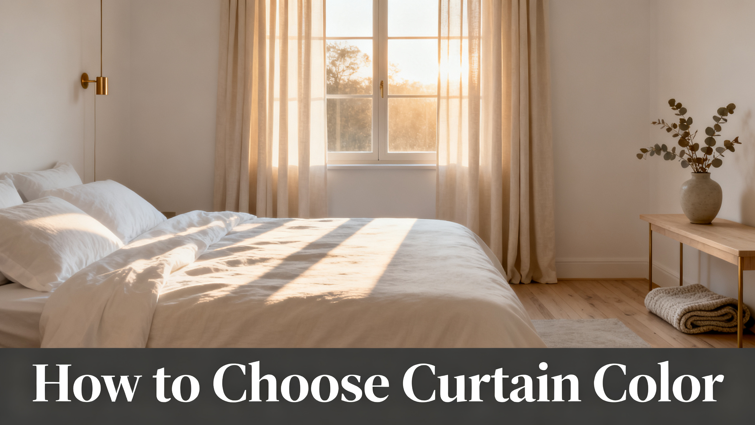
Renter with beige-painted walls, first-home owner staring at a $59 configurator, or seasoned decorator specifying window three of five? Each of those buyers picks a curtain color by a different rule. The renter picks for reversibility. The first-home owner picks for 8 to 10 years of stability. The designer picks for saturation depth at a 108-inch drop.
Here is the framework that respects all three: 5 criteria (undertone, contrast, room function, light exposure, saturation tolerance), a swatch protocol that costs $3.99, and three persona picks at the end. Everything downstream lives in the full curtain color hub for the wall-by-wall breakdowns.
Persona 1
🔑 Renter
Priority: reversibility. Panel must follow through 2 to 3 apartments without clashing.
Rule that matters most: saturation tolerance kept low.
Persona 2
🏠 First-Home Owner
Priority: 8-year stability. Panel must survive one wall repaint and one sofa swap.
Rule that matters most: undertone locked to a durable neutral family.
Persona 3
🎨 Luxury Designer
Priority: saturation depth at long drop with hardware harmony across the room.
Rule that matters most: contrast level engineered as a statement.

The panel this color guide is built around
Liz Linen Blend Drapery Pleated
from $59/panel · 140 gsm linen blend · 38 colorways from Snow White to Dark Grey · 9 header styles · 6 lining options. Final price depends on size and lining.
Use code JULY for 20% off sitewide · Free shipping over $300
Decision Flowchart · Which curtain color for you?
Step 1
Undertone
Match wall undertone. Warm wall → warm curtain. Cool wall → cool curtain.
Step 2
Contrast
Ceiling <9 ft → low. Ceiling >10 ft → mid or high tolerable.
Step 3
Function
Bedroom desaturated. Office saturated. Nursery pale. Kitchen warm off-white.
Step 4
Light
North → warm curtain. South → cool curtain. West → UV-tolerant colorway.
Step 5
Saturation
Turnover long → whisper. Turnover short → statement acceptable.
Criterion 1: Undertone (Warm vs Cool, and Why Two Beiges Never Match)
What undertone actually is
Every color carries a warm or cool bias underneath its named hue, even the ones that look neutral. Beige can lean yellow (warm) or grey (cool). White can lean cream (warm) or blue (cool). Grey can lean brown (warm) or blue (cool). The Munsell color notation for hue, value and chroma is the industry standard that formalizes this warm-to-cool axis inside every color family.
Real talk: “greige” does not exist as a stable color. It lives on the warm-cool border and flips depending on the light source next to it. What reads greige at noon reads warm beige at 4pm under west sun and reads cool grey at 9pm under LED. That is why “just get greige” is the single most common piece of curtain color advice, and also the single most common source of buyer regret.
The match-undertone-not-hue rule
Match the undertone of your curtain to the undertone of your wall, not the nominal hue. A warm-white wall wants a warm-white or warm-beige curtain, not a cool-white curtain that would read blue-shifted against the wall. This rule holds for every wall color, from pure white to charcoal grey.
Undertone Matrix · Wall × Curtain Pairings
| Wall | Warm curtain pick | Cool curtain pick | Verdict |
|---|---|---|---|
| Warm white (cream) | Beige White 1908-1 | Snow White 1908-0 | Warm wins |
| Cool white (blue-white) | Ivory White 1908-2 | Snow White 1908-0 | Cool wins |
| Warm beige | Sand Beige 1908-3 | Grey Beige 1908-6 | Warm wins |
| Cool grey | Burlywood Birch 1908-5 | Grey 1908-11 or Fog 1908-18 | Cool wins |
| Warm greige | Tapioca 1908-7 | Pure Cashmere 1908-15 | Warm wins |
| Cool greige | Taupe Grey 1908-8 | Rock Grey 1908-12 | Cool wins |
Liz colorways across the warm/cool axis
The Two Pages Liz Linen Blend palette is one of the widest color libraries in US drapery, with 38 colorways spanning the full undertone range. Snow White 1908-0 and Fog 1908-18 sit on the cool side. Sand Beige 1908-3, Burlywood Birch 1908-5 and Rust Brown 1908-9 sit on the warm side. Grey 1908-11 sits at neutral cool, and Chocolate Tart 1908-13 anchors the deep warm end.
⚠️ The single most common color regret is buying a beige curtain with a warm undertone for a room with cool grey walls. The two beiges look identical in a studio photo and clash under LED lighting at home. Always swatch under your actual bulbs, not the vendor page.
If it were my own dining room, the pick would be Sand Beige 1908-3 on a warm-white wall or Fog 1908-18 on a cool-grey wall. Three warm swatches and three cool swatches taped side by side settle every borderline case in under five minutes.
Criterion 2: Contrast Level (Monochromatic to Bold)
Contrast is value distance, not hue distance
Contrast measures how many light-to-dark steps separate your curtain from your wall, independent of hue. A pale beige curtain on a pale beige wall is monochromatic, regardless of whether the hue is warm or cool. A deep charcoal curtain on a pale beige wall is high contrast, regardless of undertone alignment.
The reason this rule holds is architectural. Contrast frames the window and pulls the eye toward it. Low contrast lets the window recede into the wall plane. High contrast turns the window into a focal object. Both are valid, but they answer different design intents.
The 5 contrast tiers
The clean tiers, from safest to boldest: monochromatic (curtain within one value of wall), low (2 values), mid (3 to 4 values), high (5+ values), and bold (complementary hue instead of value shift). Each tier reads differently and each rewards a different room type.
What Color Curtains Go with White Walls?
White is the wall that flatters the widest range of curtain colors and also the wall where a bad choice looks most obvious. The dedicated guide covers 8 pairings by undertone.
Contrast Level · Liz Colorway on a Warm Beige Wall
Monochromatic
Sand Beige 1908-3
Low
Burlywood Birch 1908-5
Mid
Taupe Grey 1908-8
High
Chocolate Tart 1908-13
Bold
Sepia Ebony 1908-14
Ceiling height dictates the ceiling on contrast
Rooms with ceilings under 9 feet almost always look larger with low or monochromatic contrast, because visible framing shrinks perceived height. Ceilings over 10 feet tolerate mid and high contrast because the extra vertical space absorbs the frame. Paired with the right curtain length, contrast becomes the second-highest-leverage color variable in the room.
Verdict on contrast: monochromatic is the safest luxury look, high contrast is the loudest statement but only reads as intentional when a second element in the room (throw pillow, art frame, rug border) echoes the curtain hue. Isolated high contrast reads as accidental.
Criterion 3: Room Function (Living, Bedroom, Kitchen, Nursery, Office)
Each room imposes a direction on hue and a ceiling on saturation, independent of personal taste. Living rooms reward mid warm neutrals because they photograph well and welcome visitors. Bedrooms reward cool desaturated blues and greys because the eye reads them as restful. Kitchens reward warm off-whites because they interact well with food and morning light. The Sherwin-Williams color psychology reference maps most of these room-hue defaults to psychological response data.
Nurseries reward pale desaturated colorways for visual calm, and home offices reward deep saturated colorways (charcoal, deep grey, chocolate) that promote focus and reduce screen glare reflection.
How to Make a Small Room Look Bigger with Window Treatments
In tight rooms, color choice does 60 percent of the work and rod placement does the other 40. This companion guide covers the spatial half.
Room Function · Hue Direction and Saturation Ceiling
| Room | Hue direction | Saturation ceiling | Liz colorway default |
|---|---|---|---|
| Living | Mid warm neutral | Statement | Sand Beige 1908-3 |
| Bedroom | Cool desaturated | Soft | Fog 1908-18 |
| Kitchen | Warm off-white | Whisper | Beige White 1908-1 |
| Nursery | Pale desaturated | Whisper | Snow White 1908-0 |
| Home office | Deep saturated | Bold | Sepia Ebony 1908-14 |
Function overrides personal taste on two axes only: safety-adjacent rooms (nurseries need low visual stimulation) and productivity rooms (offices need cognitive focus support). Everywhere else, personal taste is the tiebreaker after function narrows the field.
Criterion 4: Light Exposure (North, South, East, West Facing)
The exposure of a window dictates the color temperature of the natural light entering the room, which distorts every color inside it. North-facing rooms receive cool blue-shifted light all day. South-facing rooms receive warm yellow-shifted light intensified between noon and 4pm. East-facing rooms swing from warm morning to cool afternoon. West-facing rooms swing from cool morning to warm intense afternoon.
The rebalance rule follows: cool light needs a warm curtain to bring the room back to neutral, and warm light needs a cool curtain. North-facing rooms take Sand Beige, Burlywood Birch or Grey Beige. South-facing rooms take Fog, Grey or Snow White. East-facing rooms take balanced neutrals. West-facing rooms need a UV-tolerant colorway because the late-afternoon exposure fades saturated hues fastest. This is where layering a sheer under the color panel pays off, since the sheer takes the UV hit and the color panel behind it stays saturated.
Light Exposure · Colorway Pick by Facing Direction
🧭 North
Cool blue-shifted light
Warm curtain rebalances.
Pick: Sand Beige 1908-3, Burlywood Birch 1908-5
☀️ South
Warm yellow-shifted light
Cool curtain rebalances.
Pick: Fog 1908-18, Grey 1908-11, Snow White 1908-0
🌅 East
Warm morning, cool afternoon
Neutral tolerant of both.
Pick: Grey Beige 1908-6, Tapioca 1908-7
🌇 West
Warm intense afternoon
UV-tolerant colorway required.
Pick: Rock Grey 1908-12, Grey 1908-11

North-Facing Room? Fog 1908-18 Reads Warmer Than It Looks in Studio.
from $59/panel · Fog is the Liz colorway that neutralizes cool north light without going yellow. The same panel in Sand Beige 1908-3 goes the other direction for south-facing rooms. Swatch both before committing.
⚠️ West-facing panels fade 2 to 3 times faster than north-facing ones at equivalent hours. A saturated colorway (Rust Brown 1908-9, Sepia Ebony 1908-14) on a west window will shift visibly in 3 to 5 years. Pair it with a UV-blocking sheer or accept the fade curve.
Here is the color mistake I see most often on Trustpilot returns: buyers pick for how the room looks at noon and forget how it looks at 4pm. The most expensive color decision in the house is made on a Saturday-morning studio comparison and paid for over the next eight years of afternoon light.
Criterion 5: Saturation Tolerance (How Bold Can You Live With Daily?)
Saturation measures the intensity of a hue, independent of lightness and undertone. Snow White has near-zero saturation. Ivory Beige has low saturation. Rust Brown has mid saturation. Sepia Ebony has high saturation. The saturation you can live with depends on how much time you spend in the room daily and how often you plan to change the decor.
The four tiers, in order of visual intensity: Whisper (Snow White 1908-0, Ivory White 1908-2, Beige White 1908-1), Soft (Sand Beige 1908-3, Fog 1908-18, Grey Beige 1908-6), Statement (Rust Brown 1908-9, Burlywood Birch 1908-5, Chocolate Tart 1908-13), and Bold (Sepia Ebony 1908-14, Dark Grey 1908-17, Carbon Grey 1908-16). Each tier has a different psychological weight in the room.
Saturation Tolerance Ladder
Whisper
Reads as background. Nursery, kitchen, guest room, long-turnover primary bedroom.
Soft
Reads as considered. Living, bedroom, hallway. Safest all-purpose tier.
Statement
Reads as intentional. Dining, formal living, home library. Requires echo elsewhere in room.
Bold
Reads as declarative. Home office, home theater, primary bedroom of a decorator who repaints every 3 years.
The rule: the longer your turnover, the lower your saturation. A renter who moves every 2 years can pick statement without regret because the panel does not need to survive a wall repaint. A first-home owner who plans to stay 8 to 10 years should stay in the Soft tier because two paint cycles will happen underneath the curtain. “Renter can bold, luxury owner should whisper” is a shortcut that holds in about 80 percent of cases.
Liz Linen Blend · 38 Colorways Palette Strip
Studio swatches. Actual color varies under your light. Order the booklet before the panel.
Lead Time and Swatch Protocol (Order the Booklet Before the Panel)
Two Pages lead time on Liz Linen Blend Drapery Pleated is 3 to 4 weeks handcrafted per panel. The 38-color booklet ships in 3 to 5 days for $3.99. The ratio $3.99 divided by $59 equals a 6.7 percent risk premium on the panel purchase. That is the single highest-leverage risk reduction available anywhere in the buying process, and the step that separates panels that stay hung for 8 years from panels that get relisted at 40 percent off in month three.
Picture your Sand Beige swatch taped to the wall at 4pm, backlit by west sun, next to a Fog swatch on cool morning light. That physical comparison is what studio photos cannot show. Studio photos flatten linen texture, shift undertones under LED, and make every warm neutral look like every other warm neutral. A physical swatch settles ambiguous cases in 90 seconds.
Swatch Testing Protocol · 4 Steps
Step 1
Order the booklet
$3.99, 3-5 days shipping, 38 physical swatches.
Step 2
Tape to wall
Beside the window frame. Tape 3-4 candidate swatches side by side.
Step 3
Observe 3 moments
9am, noon, 4pm. Under both natural light and LED bulbs.
Step 4
Wait 24 hours
First-hour reactions overweight novelty. Second-day reactions predict 8-year satisfaction.
Hold the Color Against Your Actual Wall Before You Commit.
The Liz Linen Blend Booklet ships all 38 colorways flat for $3.99. Studio photos flatten linen texture and shift undertones under LED lighting. A physical swatch held at your window at 4pm settles the decision in 90 seconds.
Three Persona Picks: Renter, First-Home Owner, Luxury Designer
The five criteria above filter roughly 90 percent of the catalog. The final pick depends on which persona best describes your situation. Here is the pick that would go on the checkout page for each.
The renter default is Liz Linen Blend in Sand Beige 1908-3 or Fog 1908-18, whichever matches the current apartment’s wall undertone. Both colorways follow through 2 to 3 moves without clashing with the next unit. No lining upgrade at $59 per panel keeps the risk manageable, and the panel resells on a moving-day marketplace at 60 percent of retail if it does not fit the next place.
The first-home owner default is Liz Linen Blend in Grey Beige 1908-6 or Burlywood Birch 1908-5, paired with a cotton flannel lining upgrade for drape weight and light diffusion. Both colorways sit in the Soft saturation tier and hold up through two paint cycles (one repaint typically happens every 4 to 6 years). The lining upgrade adds $18 to $28 per panel depending on size and returns 10-plus years of daily use.
The luxury designer default is Birkin Velvet Drapery Pleated in a saturated deep colorway (Emerald, Sapphire, or Wine among the 37 velvet colorways), blackout lining, custom drop at 108 inches or matched to the ceiling minus 1 inch. Velvet at that drop reads as architectural rather than domestic, and the saturation tier is where luxury drapery differentiates from mass-market. The Birkin Velvet Drapery Pleated is the panel line that supports this specification without stepping out of the Two Pages ecosystem.
Persona-Pick · 3 Configurations Ready to Order
🔑
Renter Default
Liz Linen Blend · Sand Beige 1908-3 or Fog 1908-18 · no lining · from $59/panel
Follows through 2-3 moves. Resale-friendly. Safest saturation tier.
🏠
First-Home Owner Default
Liz Linen Blend · Grey Beige 1908-6 or Burlywood Birch 1908-5 · cotton flannel lining · from $79/panel
Holds through two paint cycles. Soft saturation tier. 10-year horizon.
🎨
Luxury Designer Default
Birkin Velvet Drapery · saturated deep colorway · blackout lining · 108″ drop · from $149/panel
Architectural drop. Bold saturation tier. Hardware harmony required across room.
How to Make a Rental Apartment Look Expensive
Curtain color is the single highest-leverage upgrade a renter can make. The full rental playbook adds rod placement, header choice, and length rules.
One panel line, three personas, three completely different picks. That is the framework at full resolution: same catalog, three answers, all correct for the buyer who asked.
One Panel, 38 Ways to Get the Color Right.
Liz Linen Blend Drapery Pleated: 140 gsm, 38 colorways from Snow White to Dark Grey, 9 header styles, 6 lining options. from $59/panel. Code JULY (20% off sitewide) · Free shipping over $300 · lead time 3-4 weeks handcrafted.
FAQ: Choosing Curtain Color
Should curtains match walls or contrast?
Neither by default. Match undertone (warm curtain for warm wall, cool for cool) and choose contrast level by ceiling height. Ceilings under 9 feet reward low-contrast monochromatic pairings, ceilings over 10 feet tolerate mid to high contrast. High contrast reads as intentional only when a second element in the room echoes the same hue.
What color curtains make a room look bigger?
Curtains one or two values lighter than the wall, in the same undertone family, hung floor to ceiling with the rod 4 to 6 inches wider than the frame on each side. That combination reads as extended wall rather than window frame. Snow White 1908-0, Fog 1908-18 or Sand Beige 1908-3 are the safest Liz picks. Bold saturated colorways shrink a small room visually.
How do I choose curtain color for a north-facing room?
North light is cool and blue-shifted. Warm colorways (Sand Beige, Burlywood Birch, Grey Beige) rebalance the room. Cool colorways can work if the room already carries warm accents elsewhere, otherwise the result reads clinical.
How do I choose curtain color for a south-facing room?
South light is warm and yellow-shifted. Cool colorways (Fog 1908-18, Grey 1908-11, Snow White) rebalance the room. Warm colorways work but tolerate less saturation before reading as heated at 4pm.
Should curtains match the sofa or the walls?
The walls, usually. Curtains and walls form the background architectural surfaces, so they should read as one visual field. The sofa is a foreground object and can carry a contrasting hue. Matching curtains to the sofa is the shortcut to a room that looks like a hotel lobby.
How do I choose curtain color for a rental?
Warm-neutral or cool-neutral in the Whisper or Soft saturation tier. Sand Beige 1908-3 and Fog 1908-18 in Liz Linen Blend follow through 2 to 3 apartment moves without clashing. Statement or bold colorways make the panel apartment-specific, which is expensive when the next lease starts.
Do dark curtains make a room feel smaller?
Not automatically. Dark curtains in the same undertone as the wall (both warm or both cool) can deepen the room and create the illusion of a further plane. Dark curtains in opposite undertone shrink the room by fragmenting the visual field. High contrast in a room under 12 feet wide is where dark curtains most often fail.
How long does it take to receive Two Pages curtains after choosing a color?
Two Pages lead time is 3 to 4 weeks handcrafted per panel. The swatch booklet ships in 3 to 5 days for $3.99. That booklet is the single highest-leverage risk reduction in the entire buying process: it prevents a color regret on a $59 to $199 panel by letting you observe the colorway under actual lighting at three moments of the day before committing.
